MOLECULAR VISUALIZATION SPREAD
A mock two-page infographic for Scientific American. This infographic highlights the special fluorescent properties of green fluorescent protein (GFP) and its derivatives, and how fluorescent proteins are used in biosensors to study tumour cells. A variety of sources and 3D protein imaging tools were utilized in creating this spread. A list of references used can be found here. The target audience is an educated lay audience with interest in molecular biology.
format
Print, magazine, webpage
tools
Illustrator, Photoshop, Chimera 3D, 3D Protein Imager, VMD, Autodesk Maya, Blender 3D
client
Derek Ng (Prof.), 2021
SKETCH
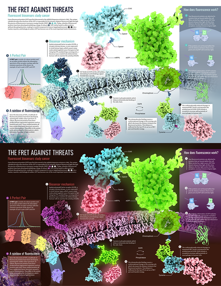
The sketch was made after compiling research from various articles and searching the PDB database. I found this article which details how a FRET-based biosensor was built using enhanced GFP and mRFP to detect the activity of tumour cells in vivo. I decided to feature the phosphorylation mechanism described in the article as the main series of steps in my spread.
Keeping in mind the target audience, I decided to explain fluorescence (FRET) in more detail as a callout, and how the structure of GFP contributes to its ability to fluoresce. At this early stage, I experimented with different layouts before deciding on what sections to include.


REFINED SKETCH
After finalizing my sketch layout and the main story I wanted to tell in my visualization, I wrote up the text and mocked up the rough placement in Illustrator. This part was tricky, as it took several drafts of editing the descriptions such that they would make sense to a more general audience.

FINAL RENDERING
I used a combination of Molecular Maya + Arnold Renderer, Chimera 3D, 3D Protein Imaging, and VMD to render the molecules. I experimented with colour palettes and values in Photoshop and I ended up making two versions of the spread: one light and one dark. The main challenge was that GFP and RFP's colours were not able to be changed, so I was limited in options. I think there are certain qualities unique to each version, but if I was to do this project again, I would decide the colour scheme more cohesively in the beginning.